Dan Robinson
EF5
It's about that time of year when everyone starts looking at the drought monitor and CPC climate outlook for spring, and subsequently either freaking out or jumping for joy. But how reliable are those for predicting the quality of the chase season?
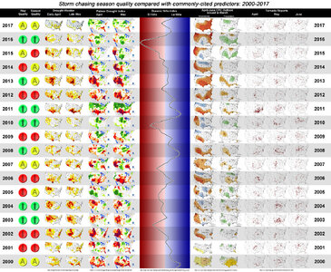
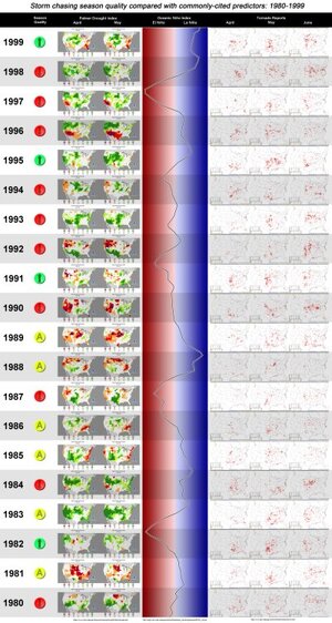
I decided to create these graphics showing side-by-side images of commonly-cited predictors of chase seasons and how the seasons actually turned out.
Graphic A:
2000-2017: UNL Drought Monitor as of early April/late May, Palmer Drought Index for April and May, Oceanic Nino Index, the April-June CPC climate outlook issued in March, SPC tornado reports for April, May and June and my subjective opinion on whether a May and overall season was above average, average or below average in quality. My opinion on "quality" takes into account the quantity of good chase events and availability of chaseable, photogenic storms/tornadoes during the peak season.
This is a huge image (6.5MB in size), so you will need to use this Dropbox link if you want to view it in full size (it's too big for the forum):

Graphic B:
Palmer Drought Index maps, Oceanic Nino Index and April, May and June tornado reports from 1999 through 1980. The "chase season quality" was assessed using the number of events chronicled in the Stormtrack magazine archives (veterans who chase during this time, please correct me if I am off on any of these!):
1980-1999 graphic full:

Spoiler: I see no reliable correlation between drought conditions, precip/temp outlooks and the quality of chase seasons. I think all the talk about dry conditions leading to poor seasons or "everything east of I-35" are urban legends that have entrenched themselves in the chase community. What do you think?
Sources:
UNL drought monitor archives:
Map Archive | U.S. Drought Monitor
SPC monthly reports:
New Rufsum Page - NOAA/NWS Storm Prediction Center
SPC SeverePlot:
SPC Historical Severe Weather Database Browser (SeverePlot 3.0)
CPC outlook archives:
Climate Prediction Center - Monthly Verifications
Palmer drought index maps:
Historical Palmer Drought Indices | National Centers for Environmental Information (NCEI)
I decided to create these graphics showing side-by-side images of commonly-cited predictors of chase seasons and how the seasons actually turned out.
Graphic A:
2000-2017: UNL Drought Monitor as of early April/late May, Palmer Drought Index for April and May, Oceanic Nino Index, the April-June CPC climate outlook issued in March, SPC tornado reports for April, May and June and my subjective opinion on whether a May and overall season was above average, average or below average in quality. My opinion on "quality" takes into account the quantity of good chase events and availability of chaseable, photogenic storms/tornadoes during the peak season.
This is a huge image (6.5MB in size), so you will need to use this Dropbox link if you want to view it in full size (it's too big for the forum):
Graphic B:
Palmer Drought Index maps, Oceanic Nino Index and April, May and June tornado reports from 1999 through 1980. The "chase season quality" was assessed using the number of events chronicled in the Stormtrack magazine archives (veterans who chase during this time, please correct me if I am off on any of these!):
1980-1999 graphic full:
Spoiler: I see no reliable correlation between drought conditions, precip/temp outlooks and the quality of chase seasons. I think all the talk about dry conditions leading to poor seasons or "everything east of I-35" are urban legends that have entrenched themselves in the chase community. What do you think?
Sources:
UNL drought monitor archives:
Map Archive | U.S. Drought Monitor
SPC monthly reports:
New Rufsum Page - NOAA/NWS Storm Prediction Center
SPC SeverePlot:
SPC Historical Severe Weather Database Browser (SeverePlot 3.0)
CPC outlook archives:
Climate Prediction Center - Monthly Verifications
Palmer drought index maps:
Historical Palmer Drought Indices | National Centers for Environmental Information (NCEI)
Attachments
Last edited:


