• A friendly and periodic reminder of the rules we use for fostering high SNR and quality conversation and interaction at Stormtrack: Forum rules

    P.S. - Nothing specific happened to prompt this message! No one is in trouble, there are no flame wars in effect, nor any inappropriate conversation ongoing. This is being posted sitewide as a casual refresher.

Sig. Tor. Parameter

Oliver W

Enthusiast
Joined
Nov 1, 2021
Messages
7
Location
United States, Indiana
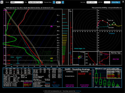
Hey! Can someone please explain what these graphs and charts mean? I’m having a hard time figuring it out. This is the Sig. Tornado Parameter HRRR model if that helpsIMG_0335.jpeg
 
What you are looking at is a forecast sounding (in this case from the HRRR model). It isn't specific to the Sig Tor parameter. You got it when you clicked on a point on the map. You would have gotten the same thing if you had clicked on that point on any other parameter being displayed on the map. (Side note - you can see actual observed soundings from NWS weather balloons at https://www.spc.noaa.gov/exper/soundings/ ).

The box in the upper left is a Skew-T Log-P diagram. The horizontal axis is temperature in Celsius and the vertical axis is pressure (which decrees with height which is why you also see markings in km). It is called a Skew-T because the temperature skews 45 degrees upward and to the right along the dashed lines and Log-P because atmospheric pressure decreases logarithmically with increasing elevation. The green line is the forecasted dew point and the red line is the forecasted temperature. You can learn the basics here: https://www.noaa.gov/jetstream/upperair/skew-t-log-p-diagrams . There is a lot more to this like CAPE, the cap, etc. See the links at the bottom for more information.

The box at the upper right is a Hodograph. A hodograph is a polar coordinate graph which shows the vertical wind profile. These plots are used to determine the advection patterns aloft, whether a thunderstorm will rotate, and the type of thunderstorms that you will likely see that day. On the graph, only the tip of wind vectors are plotted. The tips are denoted by a dot. As the distance between the dot and the center of the graph increases, the magnitude of the wind will also increase. These dots are sequentially connected together by a line. You can learn the basics here: https://www.weather.gov/media/lmk/soo/Hodographs_Wind-Shear.pdf

There is a ton of information in the bottom boxes, but if you review all of the links in my reply you will likely pickup some of it. Fell free to come back and ask questions after you review.

Other good resources: https://vlab.noaa.gov/web/operations-proving-ground/-/skew-t-hodograph-basics and
.
 
Great explanation @Randy Jennings, there's a lot to cover with that question, lol. Took me a solid 3 months to grasp everything that's in a forecast sounding. I'd read up on the Skew T and Hodograph first as I think that will help with understanding the other parameters a little easier.
 
Back
Top