New Model Site: PivotalWeather

Joined
Jan 7, 2006
Messages
641
Location
Oklahoma
A few friends and I have been working on a new site for model data, with the primary focus (initially, at least) on severe weather and the central CONUS. Check it out:

http://www.owxdata.com

For chasers, the highlight will probably be the fast-updating HRRR graphics with regional zooms. These graphics should start coming in about 45-50 min after initialization (i.e., 1:50pm for the 18z run), which is a lot faster than the official ESRL HRRR site. We also have "accumulated UH" maps for each run, which I'm not aware of being produced elsewhere right now, at least on free sites.

Note that we are running ads, and are also accepting donations if anyone wishes to contribute. We're currently making the most of very limited resources, but could likely expand the graphics offerings significantly (in terms of both regional/state zooms and parameters) with better infrastructure -- we also hope to have clickable soundings if we're able to get a nice dedicated server down the road. For now, take a look at what we've got and feel free to let us know (either here or via the Contact page on the site) if you have any suggestions or comments.

A few sample graphics:

00z NAM forecast 0-3 km EHI for tomorrow evening (south-central US zoom):
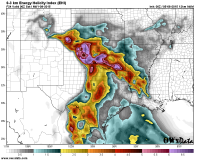
03ehisc.png

00z HRRR composite reflectivity for 04z (OK state zoom):
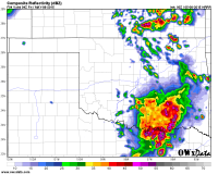
crefok.png

00z HRRR accumulated UH through hour 15 (south-central US zoom):
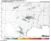
accmaxuhsc.png
 
I didn't know you were working on this site! I like the graphics; especially the ECMWF graphics. Much more visually appealing than what Matplotlib does with that poor data resolution. What plotting software are you using?
 
Yeah, the EC access is surprising since they usually don't allow higher-res for free. Good work snagging that dataset :)
 
Great stuff! I'm still partial to CoD, but the additional Euro data is a unique and very valuable addition.

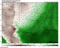
Can I make a minor suggestion? On the 2 m T and Td graphics, the color scale is very smooth (too smooth). For example, there are like 40 different shades of green for dewpoints between 40 F and 80 F. Although this makes for a nice image, with such a smooth color scale, it's very hard to match one shade of green on the map with the same shade of green on the color scale. Can you perhaps add a solid black contour every 10 degrees F or something similar? For example -- I want to find where the 62 F isodrosotherm is located. I'd be able to count up 2 shades of green from a thick-contoured 60 F isodrosotherm much more easily than I'm able to count up the 22nd shade of green (!!) above the color change that occurs at the 40 F isodrosotherm. Such very smooth color scales are nice aesthetically, but they can make finding specific values quite difficult.

For example -- try to find quickly the 60 F isodrosotherm below. I suspect many will use the text labels almost exclusively.
sfctdsc.png

As the images currently are designed, I'm finding myself just interpolating between the numbers written in text rather than trying to use the color fill. I'd just as well prefer ditching the text labels (although that's something that many other model sites don't have) and adding thicker contours (maybe thick black contour every 10 F and thin or dashed black contour every 5 F?). EDIT: Or just reducing the number of colors as @Jeff Duda suggested.
 
Last edited:
I agree with Jeff. A lot of the new sites coming out seem to try to feature extremely dense/detailed color tables. I'm guessing that's a pitch for "prettiness" to get site hits and money, but for the purposes of meaningful analysis, it makes it much more difficult. I'd suggest trimming the number of contours way down. You probably don't need more specific values than every 2 or 3 degrees F for surface temp and dewpoint, for example.

I also just noticed your labeled MSLP contours for ECMWF graphics are odd. I see very 2 mb, but odd numbers only. Are you trying to avoid the traditional 4-mb interval with 1000, 1004, 1008, 1012 mb contours marked?
 
Another alternative to the dewpoint color table might be to have bands of color gradients, like on the EHI graphic in the original post. That strikes a middle ground between the color gradients, which look kinda cool, and the usability. Bands might look something like this (numbers are dewpoint temperatures in degrees F)

upload_2015-5-11_18-16-56.png

Full disclosure: I haven't actually looked at that as plotted with actual data, so it might look awful in practice. It could probably be improved with different color selections, this was just to illustrate an idea.
 
Appreciate the suggestions, everyone - keep 'em coming!

@Jeff Duda, @Jeff Snyder, @Tim Supinie:
We've actually been contemplating different options for the dew point color table -- it's been surprisingly difficult to find one that works within the relatively smooth-gradient aesthetic we've built the site around. As of today, we've switched to a candidate color table we had that's actually not too far off from what you suggested, @Tim Supinie. Hopefully, the obvious gradients at 50, 60, 70, and 80 F make it easier to discern values at a glance.

The text values for T and Td are plotted at METAR sites, partially for easy verification and also just to help keep the colors in context without having to look down at the color table. While this method of presentation is a bit ad hoc and differs from almost all existing NWP model sites that I'm aware of, I've grown to find it pretty effective, for my own tastes anyway. Note also that AWIPS (software used by NWS forecasters) follows a similar presentation, with smooth color fill gradients and the option to display text values. Finally, the relatively small contour intervals for 2 m AGL plots like T and Td have the advantage of revealing small-scale details (such as those related to terrain) resolved by high-resolution models like the HRRR.

This isn't to say all these choices are set in stone going forward, of course, as we'd love to hear feedback from more users. But for now, I might suggest giving the smooth-gradient look a try for a week or two and see if you still feel the same way. I mainly do web development for this site, with others handling the plots - when I first saw our plots, it was a bit of a system shock, and I had some reservations. It grew on me quickly, though, and now I think I genuinely prefer it to the coarse 5 F-contour presentation common elsewhere.

@Tim Supinie and @rdale: we're using GrADS for plotting, and I believe there's subtle smoothing applied to the height and MSLP contours, which might be why the ECMWF data look a bit nicer than other free sites.
 
This came across my interoffice chat this morning and I thought I'd leave it here and see if it helps: http://journals.ametsoc.org/doi/pdf/10.1175/BAMS-D-13-00155.1
The article is an in depth look at color usage for visualization purposes in the weather space and is entitled: SOMEWHERE OVER THE RAINBOW: How to Make Effective Use of Colors in Meteorological Visualizations
Enjoy
 
Please remember poor folks like me who are colorblind :( Twisterdata is the best for me so far with my colorblindness.
 
UPDATE:

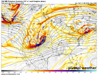
This weekend, we re-launched the site as pivotalweather.com with a major overhaul that includes:
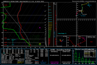
  • Clickable SHARPpy (SPC-style) soundings for all our NCEP models, including the HRRR and 4km NAM!
  • Larger, cleaner model graphics
  • A new, expanded set of regional zooms (including the oft-requested Midwest zoom)
  • Numerous new parameters, such as:
    • Vorticity and vertical velocity
    • Upper-air RH and dew point
    • Winter weather products
Please check it out and let us know if you have any comments or suggestions!

500mbrelvortconus.png nam_2015110900_069_40.27--94.87.png
 
Simply superb! Well designed, very user friendly and now a favorite of mine along with COD. The model products offered are among the most extensive among the major sites, it rivals COD in resolution and the SHARPpy forecast soundings are superior (in my opinion) to any product of its type I’ve seen with perhaps the exception of Earl’s. I’d like to see more parameters (e.g. Lid Strength) but ultimately the site is superb in the efficient access of extensive data. I like it better than TwisterData, Unisys, NCAR and all the major multiple model sites except COD but with time that might change as well. It’s certainly an excellent resource that I’ll be giving frequent use going forward.

Will regional options be offered for the RAP? Any plans to add radar and satellite?
Thanks for the kind words, Michael! And the suggestions are well taken.

In terms of parameters: we have plenty more that we'd like to add, but at some point computational resources are an issue, even with our latest expansion. Producing many additional graphics beyond what we have right now would result in a noticeable slow-down in runs coming out, and avoiding that is a priority for us. However, by severe weather season next year, we hope to have additional resources to add more specialized severe weather and chaser-friendly maps. Fingers crossed!

The RAP was added specifically to provide rapid-update CONUS maps, as producing them for the HRRR is quite computationally expensive. Our intention for now is that users look at the RAP for a large-scale view, upper winds, etc. (CONUS), and the HRRR for convective weather and fine-scale details (regional zooms). Again, if our resources expand in the future, we will consider filling in these voids by adding RAP zooms and/or CONUS maps for the HRRR.

Finally, you may be in luck with your request for observational data... stay tuned!
 
Hey @Brett Roberts really outstanding updates! You've put a ton of work into this and it really shines. I'd echo @Michael Towers that you and COD are at the top of the game. After playing around for years on all the different sites, I pretty much only used OWxData and COD (well and SPC mesoanalysis of course) during the 2015 season and really loved both.

The only area I'd give COD an edge is load time on cell networks. I did some spot checks on tonight's 00Z NAM runs, and COD's 800x600 gifs ranged from about 50-100 Kb. Your 1100x850 pngs were in the 700-800 Kb range. I can definitely feel that difference on 4G when loading up a loop. I played around with converting the pngs to jpgs, and could get file sizes in the COD range with very minor image degradation. But I bet you guys have already thought through all this and have a good rationale for the current setup. Easy for me to suggest big changes to your rendering scheme :)

Again, really top notch updates!
Awesome -- really love to hear that people are getting use out of it after all our development the past few months!

I totally hear you on the image sizes. We actually just started producing JPGs for the biggest offenders -- 2m AGL temperature and dew point maps from the HRRR and 4km NAM, which contain so much detail that file sizes in excess of 1 MB were common for PNGs. We will explore doing this for additional maps in the near future if it doesn't delay posting new runs significantly. Realistically, we know that chase season is the timeframe when bandwidth-conscious file sizes are most important, so we will probably try to find a more all-encompassing solution by then.
 
Back
Top