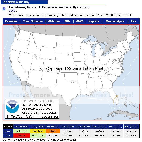
New Look/Feature to SPC Page

  • Thread starter Thread starter Dann Cianca
  • Start date Start date

Dann Cianca

hazardmatrix.jpg


Obviously not too exciting, but interesting nonetheless.
 
I think it's useful. It gives you a quick recap.
Heck, I wonder if they could incorporate it so that when you mouseover the matrix, it shows the forecast?

This is maybe just excessive, but perhaps they could also include a little tiny box below each severe/fire day to indicate how far through the forecast cycle it is or such. A tiny little 2 pixel high meter that goes from totally white (just issued) to totally black (time for a outlook). It could be done in percentage of time elapsed since the standard time that the prior outlook was for until the next one. That would really make things great there, as you could quickly see if a new outlook had been issued.
 
And, fully expecting almost no one will know what I mean, I created a proof of concept image.

http://moe.met.fsu.edu/~syoung/hazardmatrix.jpg

Honestly there's probably better ways to do it. I would worry users would get that scale mixed up with how strong the weather was supposed to be, and that's the last thing anyone wants.

Perhaps you could change the color of the text to indicate the risk is new (or old). Like add a gold border for an outlook issued in the last hour or something.

Just some way we could quickly tell if the outlook we were looking for had been updated. Especially for the many people who need the new information for issuing their forecasts and advisories and such.


Perhaps it's a little too much work for little reward, just an idea that seemed to flow out of the hazard matrix (which I think itself is very cool).
 
Back
Top