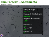
The Sacramento NWS office recently tweeted an image showing a probabilistic forecast of precipitation in their area. You can see it below. Understand that under "likely range", the 71 inches should be 0.71 inches. I'm sure that was a typo.

There is currently research going on as to how common folks interpret probabilistic weather forecasts. The term "probability of precipitation" (PoP) has been used for decades, but apparently many people still fail to grasp the meaning of it. That is understandable in some ways, as different entities within the weather enterprise (e.g., NWS forecast offices, broadcast media, and private companies) all use similar, but slightly different definitions. NWS STO's product shown above is probably an attempt to improve the communication of forecast certainty by offering more detailed probabilistic forecasts. But is this a good way of doing it? I ask for your response.
I would like to open a discussion about both this graphic and of the nature of how Stormtrack users interpret probabilistic forecasts. Please reply to this thread with your interpretation of the above graphic, and what you think it means. Please elaborate by disclosing how you feel about probabilistic forecasts. If you don't have much experience looking at generic probabilistic forecasts, you can start with just PoPs. The SPC convective outlooks, CPC medium-range to seasonal temperature and precipitation outlooks, and WPC probabilistic quantitative precipitation forecasts (PQPF) are also helpful examples of probabilistic forecasts.
ADD: please comment on the following question. Does this way of communicating the forecast probability of rain add any value to you when making a decision that requires some knowledge of if it might rain? Said differently, which forecast would you prefer: the one given in the image, or one that just says there is a 70% chance of rain, and if it rains at all, the rain total will be 0.53".
I am not involved in any way with NOAA/NWS projects studying human interpretation of probabilistic forecasts, but I am very curious to hear what others think about them.
I thank you in advance for your responses.
Last edited:
