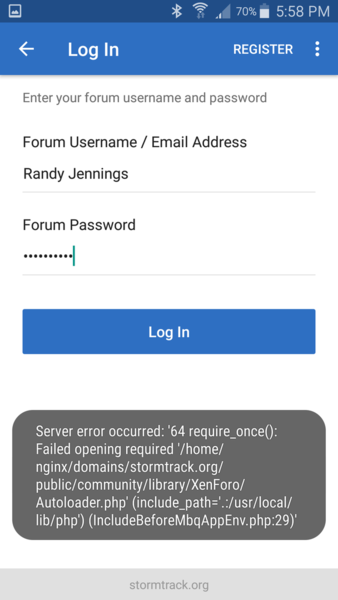
It's time for Stormtrack's annual upgrade! We will be down for maintenance Friday morning (4-5-19) and when the site returns it'll be running on an entirely new AWS server instance on the latest completely stable version of Xenforo's forum software. Primary overall site changes that'll occur on Friday are listed below. Additional goodies and features will be announced/launched next week.
- The forum will default to a dark theme with user-selectable light/dark toggle
- The forum will benefit from a major modernization that'll include the following core features:
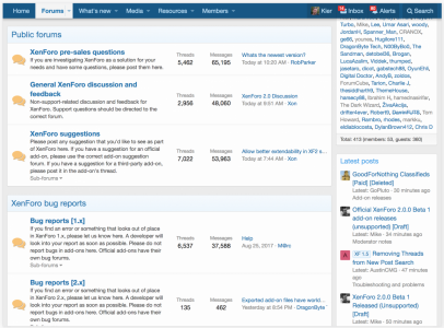
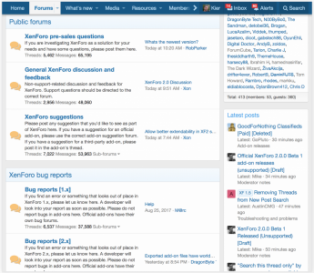
The new XenForo 2 style is the first thing you will notice in XF2. The entire style has been redesigned with a fresh new appearance, but also with mobile browsing at the forefront of the design. When the viewport shrinks, on-page content shrinks, shifts and reorganizes itself automatically to optimize the browsing experience for small displays.
A sticky header automatically activates when the window is scrolled, allowing the most important navigation controls to remain available at all times.
Emoji support*
All textual content in XenForo 2 now supports emoji, from message text to forum titles.
Retina avatar and smilie support
Avatars and smilies now support high-DPI imagery, allowing for a crisp, high-resolution display to match the text on displays that support 2x resolution graphics, such as Apple's retina displays.
Navigation manager
Both the public-facing systems and the admin control panel now have completely customizable navigation systems, allowing the content of the navigation bars and side-navigation blocks to be entirely controlled by the site administrator without any need to resort to template modification.
Enhanced message editing
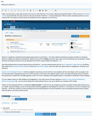
Rather than opening an overlay, editing messages are now done entirely in-place, with the content of messages replaced by a full-fledged message editor that allows the complete range of editing and posting actions, including attachment management.
Alerts in favicon
When new alerts or unread conversation messages are available, the site icon (shown in the browser title bar) will have a badge added to it, showing that there are items waiting to be viewed.

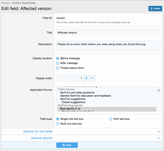
Custom thread fields
An extension of the custom user field system, threads can now have their own custom fields, with all the functionality previously available for user fields.
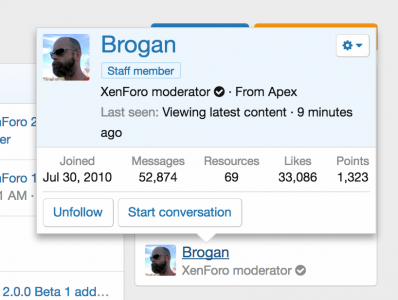
Member tooltip
XF1's member card has been replaced with a new member tooltip, which appears on the first click on a member's name. A further click will load the member's full profile page.
Customizable member stats
The old member list page has now been replaced by an all-new, customizable member statistics system. Individual statistics (such as members with the most posts, most recently-registered members etc.) can be built using an interface in the admin control panel, and are then displayed as an expandable block on the member's page.
Generic payment framework
XenForo 2 has a new payment system that is open for development, meaning that add-on developers can quickly and easily build payment gateways for providers that are not part of the core system. Using this system, XF2 ships with a number of ready-made payment options that are easy to integrate with various system enhancements that administrators may define.
Attachments shown in previews
Content previews, such as those seen when hovering a thread title on the thread list page, now include attachments for a more complete and integrated preview experience.
Enhanced code block syntax highlighting
The
Code:
 block system has been greatly enhanced to display syntax highlighting for a much wider range of programming and scripting languages through the use of [CODE=language] tags.

[B]What’s New and Find Threads[/B]

To aid in content discovery, XF2 includes a brand new 'What's new' system, which can fetch new content from all sources across the system, including threads and posts, profile posts, media items and resources. The architecture of the system is fully extensible, so add-on developers can hook into What's new in order to add their own content types to the results.

Additionally, a new Find threads system provides quick links to unanswered threads (with no replies), threads you have started, and threads in which you have posted.

[B]New media embedding features[/B]

The BB Code Media system has been significantly enhanced, and now supports embedding Facebook posts, Tweets, Instagram photos, Reddit posts and comments, Spotify and Soundcloud tracks, albums and playlists and a whole host of others.

The integration of oEmbed support allows almost any media to be embedded simply by pasting a link to the media within a message.

[B]Quick thread[/B]

Quick Thread is a brand new system for XF2. Above the list of threads on a forum page, you will find a title entry box. Focusing this box and starting to type a thread title will load a quick message editor, in which you can post the content for the first post of your new thread. Hitting the save button will then post the thread, leaving you on the forum page rather than redirecting you to the thread page. This makes the process of creating a new simple thread extremely quick and easy.

[URL='https://xenforo.com/community/attachments/qt-2-png.156936/'][IMG]https://xenforo.com/community/data/attachments/156/156936-3c8c65b43b574d724bd20c95075f994d.jpg[/IMG][/URL]

[B]Thread prompts[/B]

In conjunction with Quick thread, Thread prompts allow the title input box to display a configurable prompt, giving members a hint as to what kind of content they should be posting in any given forum. Multiple prompts may be defined and assigned to forums, and an applicable prompt will be selected at random to be displayed to the user when the page loads.

[B]Keyboard shortcut system and enhanced keyboard navigation[/B]

XenForo 2 includes an easy method to assign keyboard shortcuts to commonly-used controls, such as searching and opening the alerts list. These shortcuts are defined with simple template edits, and allow for very rapid navigation with a keyboard.

Additionally, the system can determine whether the user is currently using touch, mouse or keyboard navigation at any given time, and will highlight the currently-selected link or control appropriately when keyboard navigation is enabled while hiding the selection when using touch or mouse methods.
